

11 Apr What Makes a Good Orthopedic Brochure
Among any of the print collateral your medical office will have, arguably the most important piece will be your brochure. This will usually be a tri-fold or half-fold that will tell a little bit about your practice, contain some contact information, and hopefully drive some patients your way. Unfortunately many offices miss the mark when it comes to a well designed brochure that ultimately ends up hurting their practice rather than helping it. Here a few tips to ensure your orthopedic brochure creates the results you want.
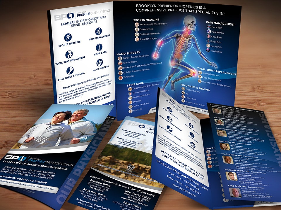
Less Words, More Visuals
This one major error is present in a great deal of medical literature. Simply put, they will include every piece of knowledge they have about every procedure they perform and condition they treat. In a nutshell, nobody wants to read any more, especially if it looks like a short novel. The wrong strategy is to cram as much information as a whole website into a small brochure. Having words that are so small that you must squint to read them all is another. Instead, keep your text to a minimum and let images drive your copy. Consider listing each condition you treat as a bullet point list rather than writing a paragraph about it. Even better, you can classify the conditions using illustrations of the corresponding body parts. The reader of your brochure shouldn’t expect to become an expert on every disease you treat after reading it. Its purpose is to pique interest, spread knowledge about your practice, and ultimately persuade the reader to visit your website or give you a call to schedule an appointment.

Have an Engaging Cover
Despite the adage that you shouldn’t judge a book by its cover, let’s face it—we all pick up a book because of its eye-catching front. The same applies to brochures. In our lifetimes, we encounter countless brochures. Most are boring and unmemorable. You should use eye-catching images for your cover. Usually, one sizable image suffices. There shouldn’t be much text. Typically, a logo, some contact details, and a brief description of the brochure’s subject matter are sufficient. The image on the cover should evoke an emotional response in the reader. A skeleton or other part of the human anatomy that the brochure is about is frequently depicted in orthopedic brochures.
Instead, try to think of something that your potential patient can relate to. Do you practice spinal surgery? How about a picture of a middle-aged father and child having fun? These kinds of straightforward tasks become impossible for people with chronic back pain. Do you practice podiatry? Imagine someone standing barefoot on the beach. Many patients who have bunions, warts, or foot fungus avoid going barefoot out of embarrassment, which gives the impression that your practice will be able to cure them of their life-altering conditions.
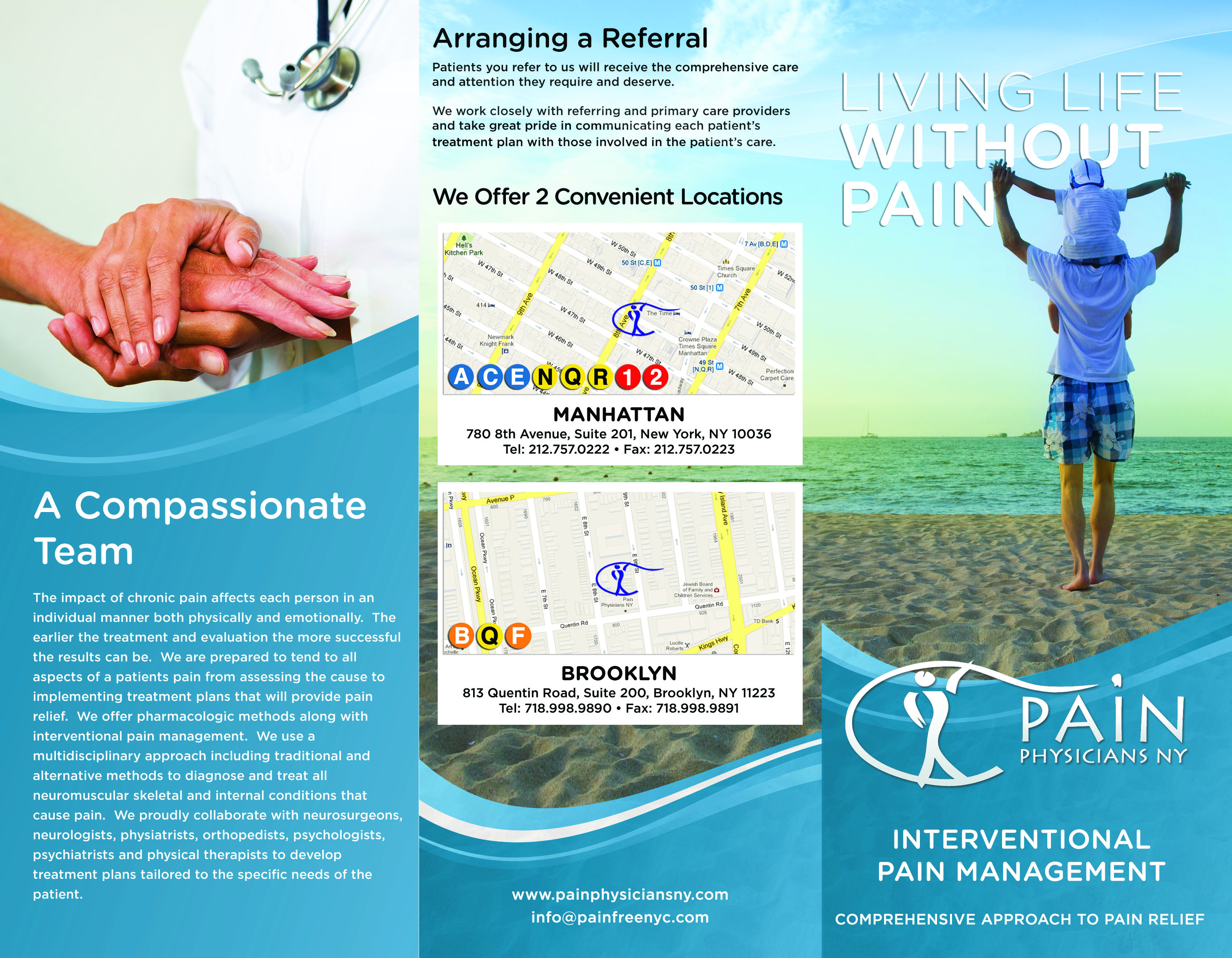
Your cover should be simple, engaging and paint a picture and be relatable to your target patient. Something as simple as picking up a child can be extremely painful for someone with back or joint pain. This cover portrays a picture of a man truly living life without pain.
Bigger Is Better
We’ve all seen countless brochures throughout our lives, as was mentioned in the previous sentence. The size and paper are typically the same.
Therefore, they can easily blend in with a rack of brochures (unless you have a stunning cover; see the preceding point!) Do you want a simple solution to this problem? Make your brochures larger to stand out from the competition! Every client is reminded by us that larger, thicker brochures tend to attract more attention. In contrast to the standard brochure size of 8.5″ x 11″, we frequently advocate for larger sizes like 8.5″ x 14″, 11″ x 17″, or 9″ x 16″.
Usually, the size difference is just enough to distinguish your brochure from the rest of the stack. We also emphasize thickening. We typically ask our clients to print on card stock rather than the same old paper stock. It feels more substantial in the hands and communicates to patients your seriousness about your practice and their well-being with a brochure that is roughly the thickness of a greeting card. Even though larger sizes and thicker paper options typically cost a few dollars more, the investment is more than compensated for by the development of new patience.
Brand Your Brochure
Branding your brochure may seem obvious, but it happens frequently enough that we feel compelled to mention it. Make sure the design of your brochure matches the rest of your practice’s branding. Make sure the cover has at least one instance of your logo. (Having it on the back as well is a good idea.) Additionally, check that the fonts and colors used in your brochure match those in your brand’s logo. Simply put, there is no reason your brochure should be green and red if your brand colors are blue and orange. There is no need to use a script font or Times New Roman if your logo has a nice, contemporary typeface.

It’s important to brand your brochure. Your logo should be on the front of your brochure. In addition if your brand colors are blue and orange, there’s no reason to be using reds and greens.
No Templates, Please!
An orthopedic practice may occasionally put off creating a brochure. This may apply to your practice’s overall marketing efforts. After all, you’re occupied taking care of patients; you’re not an expert in marketing. Because of this, brochures occasionally have sloppy design. This might entail closely replicating a brochure that you already like. Or, you could just purchase a cheap template online and edit it to fit your needs. Using the built-in templates in Microsoft Word is the worst case scenario. These methods simply give the impression that your practice is cheap and can do so. Some patients may believe that if you don’t want to make the effort to create a professionally designed brochure, that same ethic will show in the level of care you give them. Finding a qualified designer who knows what makes a well-designed brochure is much more beneficial for your practice. Find a designer who will pay attention to all of your requirements and create a stunning brochure that is tailored to your practice.
Need help creating the perfect orthopedic brochure design that will drive new patients to your practice? Graphics For Doctors has designed and printed hundreds of orthopedic brochures for many satisfied clients. We strive to make sure the brochures we design are perfectly tailored to fit your practice’s needs and get more patience through your door. Need a brochure designed for your orthopedic practice? Great! We’d love to help! Contact us by email or by calling 888-803-2021 to get started.
No Comments